

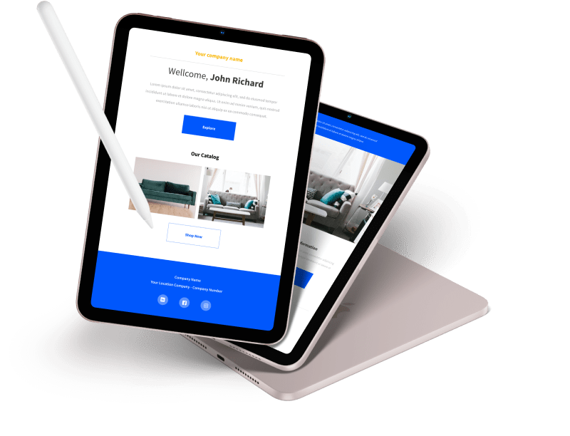
Responsive web design in 2023 continues to focus on creating websites that provide optimal user experiences across a wide range of devices and screen sizes. As technology evolves, so do the best practices for designing responsive websites. Here’s a guide to responsive web design in 2023:
-
Mobile-First Approach: Start designing your website with mobile devices in mind. As mobile traffic continues to dominate, prioritizing the mobile experience ensures that your site is accessible and usable on smaller screens.
-
Flexible Grids and Layouts: Use flexible grid systems, such as CSS Grid and Flexbox, to create layouts that adapt seamlessly to different screen sizes. This allows content to flow naturally and maintain readability.
-
Media Queries and Breakpoints: Implement media queries to apply different styles and layouts based on screen width breakpoints. These breakpoints allow your design to adapt to various devices, from smartphones to tablets to desktops.
-
Typography and Readability: Choose fonts that are legible on all devices. Adjust font sizes and line spacing for different screen sizes to ensure readability. Use responsive units like “em” or “rem” for font sizes to maintain consistency.
-
Images and Media: Optimize images for different devices to improve loading times. Use modern image formats like WebP, and implement responsive image techniques, such as the “srcset” attribute, to serve the appropriate image size based on the user’s device.
-
Fluid Typography: Implement fluid typography using CSS techniques that adjust font sizes based on viewport width. This maintains a balanced and readable typography across devices.
-
Touch and Interaction Design: Design for touch interactions on mobile devices. Ensure that buttons and interactive elements are large enough to be tapped easily, and use touch-friendly navigation patterns.
-
Performance Optimization: Prioritize performance by minimizing the use of large libraries and unnecessary scripts. Leverage browser caching, compress assets, and use techniques like lazy loading to improve page loading speeds.
-
Progressive Web Apps (PWAs): Consider turning your website into a Progressive Web App to provide a more app-like experience. PWAs offer features like offline access, push notifications, and faster loading times.
-
Testing Across Devices: Regularly test your design on various devices and browsers to ensure consistent and smooth experiences. Use browser developer tools and online testing tools to identify and fix any responsive design issues.

-
Accessibility: Ensure your responsive design is accessible to users with disabilities. Use semantic HTML, provide alternative text for images, and follow WCAG guidelines to create an inclusive user experience.
-
SEO Considerations: Keep up with the latest SEO practices for responsive design. Google and other search engines prioritize mobile-friendly websites, so ensure your responsive design meets their criteria.
-
User-Centric Design: Focus on the needs and preferences of your users. Collect feedback and analyze user behavior to continuously improve the responsive design and user experience.
-
Future-Friendly Design: Anticipate future devices and technologies. Your responsive design should be adaptable to new screen sizes, resolutions, and interaction methods that may emerge.
-
Continuous Iteration: Responsive web design is an ongoing process. Regularly analyze user data, monitor technological advancements, and make necessary design updates to keep your website current and user-friendly.
Remember that responsive web design is about more than just rearranging elements on different screen sizes. It’s about creating a consistent and enjoyable user experience across devices, focusing on performance, accessibility, and adaptability to the ever-changing digital landscape